Tata 1mg Website Redesign
A redesign of Tata 1mg’s - Care Plan Website section

1. Existing Design
Strengths
- The color palette is a standout feature,It divides the page into levels.
- The page structure is well thought out, creating a hierarchy that guides the user smoothly.
- I appreciate the use of clear and intuitive icons, they act as visual anchors for users.
- Information is neatly grouped, making it easy for users to navigate and locate what they need.
- There is a lot of information packed well together
Changes
- Playing with font sizes could elevate the clarity and readability of the content.
- Giving the header a bit more prominence could prevent any potential visual confusion.
- Experimenting with different compositions could add an extra layer of engagement for users.
- Consider incorporating additional visual elements that align with the site's theme, enhancing the overall user experience.


2. Key Features
Initial engagementTata 1mg offers a captivating introduction by presenting a visually compelling introduction, featuring a prominent "Explore" button for seamless entry. This approach distinguishes them from competitors.
Value-Enhancing Features Tata 1mg goes beyond the basics by spotlighting supplementary benefits and features alongside subscription plans. This provides consumers with a comprehensive overview of what they will gain.
Plans’ presentation
Tata 1mg excels in the clarity of subscription plans, presenting easily discernible pricing within the dedicated section.
Intuitive Plan Selection
Tata 1mg simplifies the plan selection with a streamlined approach, ensuring a user-friendly interface by a clear hierarchy. This helps in the decision making the decision-making process for users.
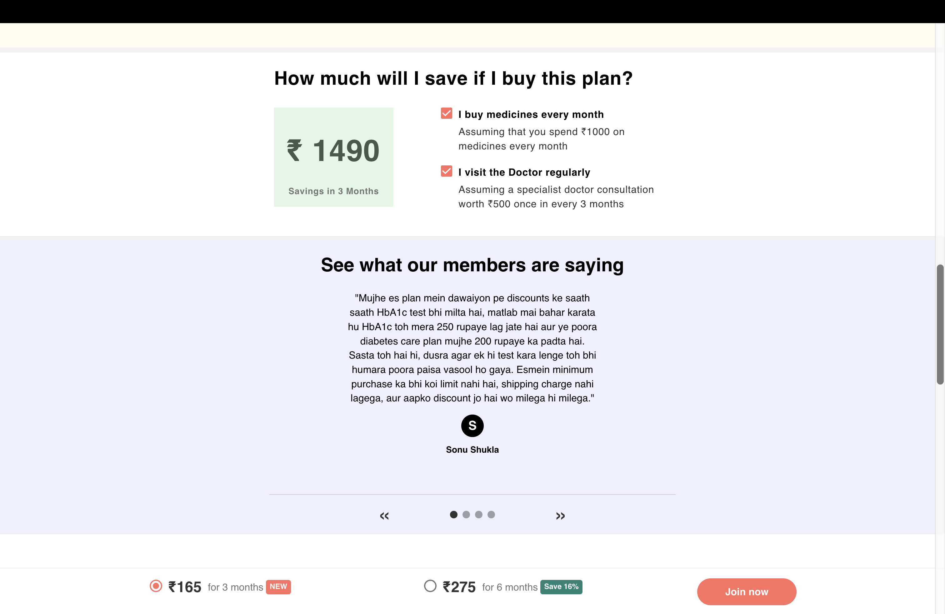
Trust Building through candid reviews
Establishing trust is evident in Tata1mg’s incorporation of authentic customer reviews. This commitment to transparency stands out.


Final Design


